V4 · 2026
VISIONMINER.COM
Brand
Identity
Guide.
High‑Performance FFF 3D Printers
Engineering‑Grade Polymers
Engineering‑Grade Polymers
Scroll
Vision Miner manufactures high-performance FFF 3D printers built for engineering-grade polymers — PEEK, ULTEM, PEKK, PPS, PPSU, and other high-temperature, chemically resistant materials. We design and build the machines, then back them with the polymers and the engineering know-how to run them.
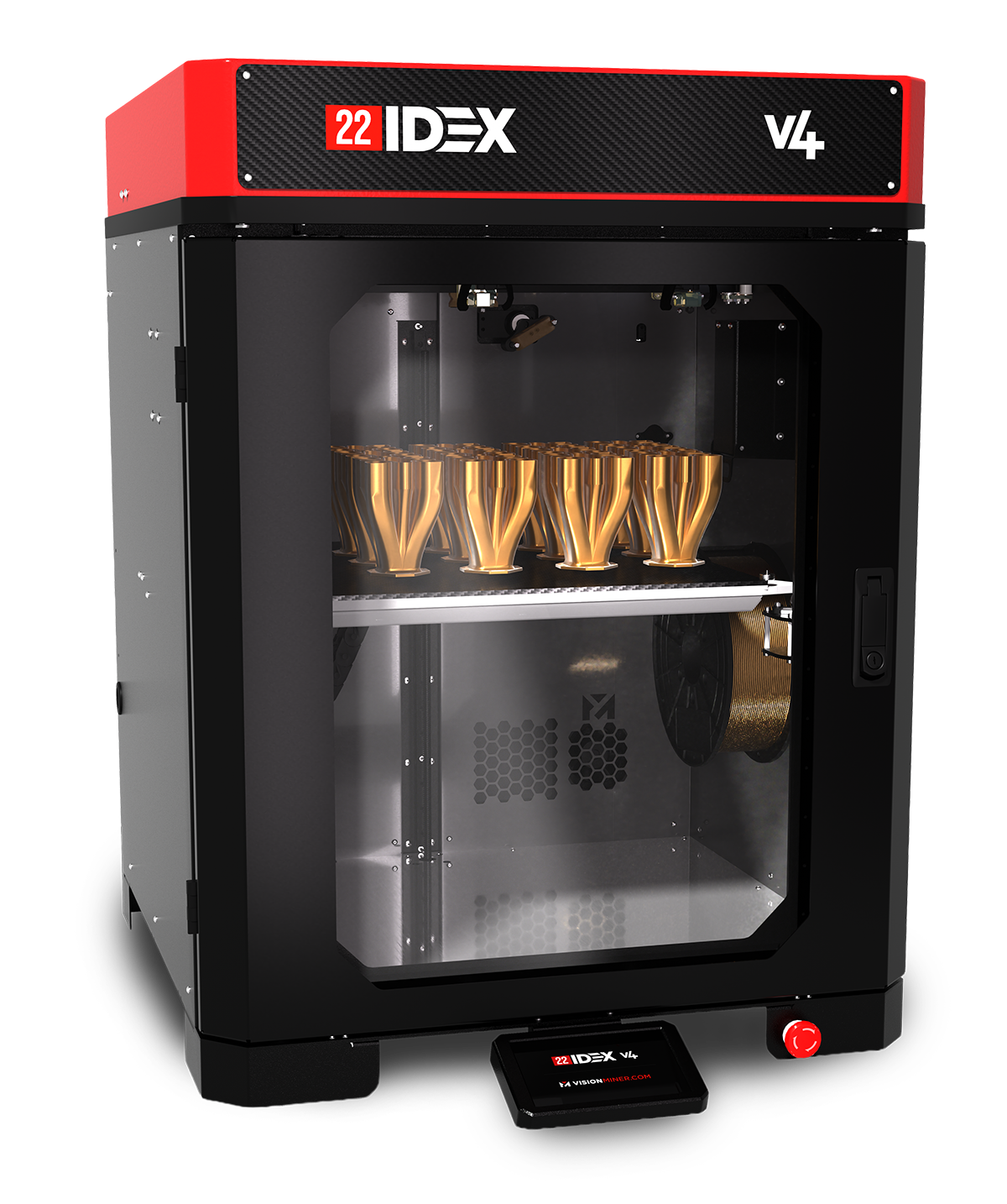
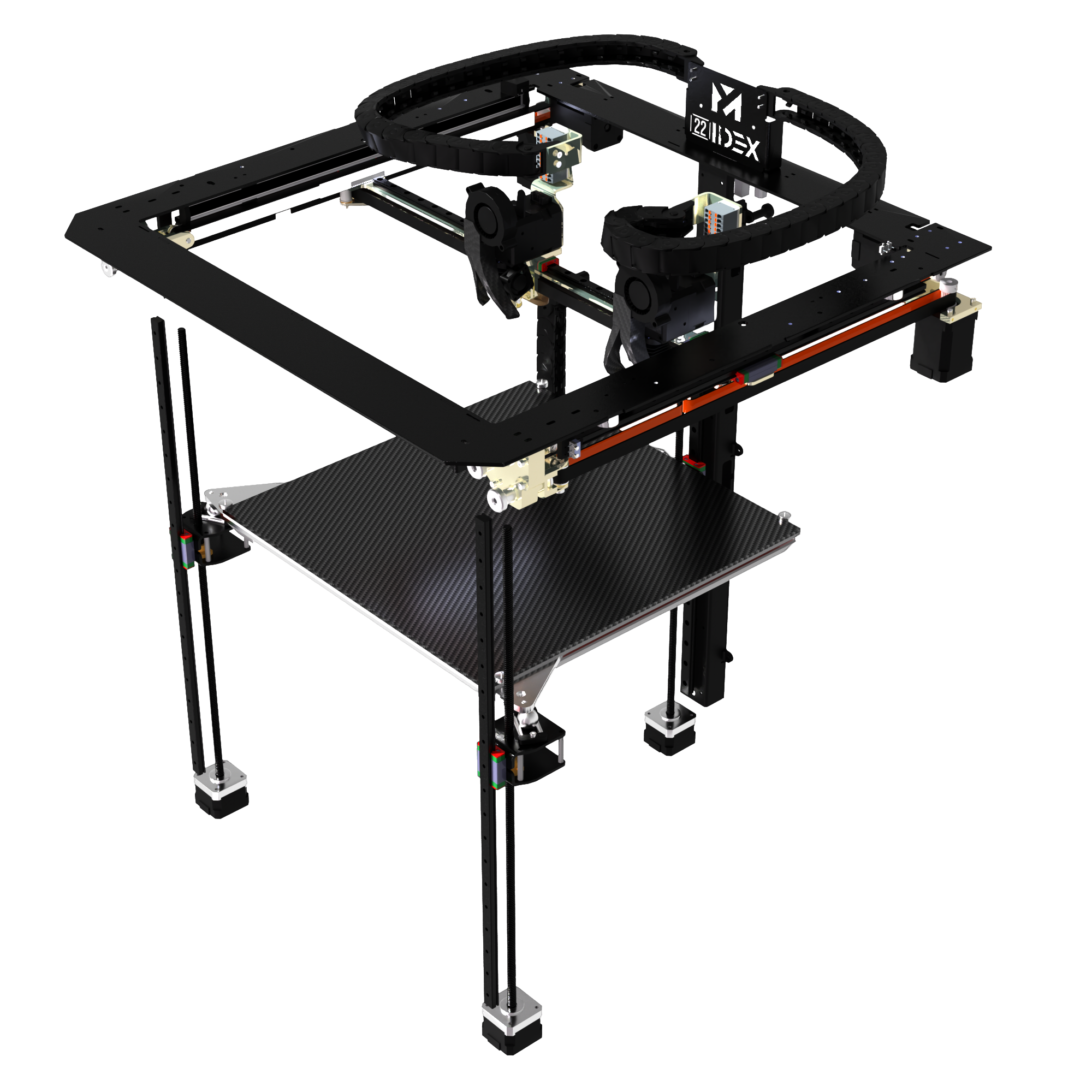
The 22 IDEX is our flagship production printer. Our customers are industrial, aerospace, defense, and research teams who need the parts they print to behave like the parts they used to machine. The brand is engineer-to-engineer: direct, technically literate, and grounded in real applications.
This document is the canonical reference for everything visual, verbal, and visceral about the brand. The PDF version is print-ready. This web version is built to be linked, scrolled, and shared.
All hex, RGB, and CMYK values are listed per swatch. Real font specimens render in this document; the underlying type files travel with the source kit.
Every Vision Miner video since 2017 ends on the same line, set against glitch-style dictionary definitions of vision and miner. It's a subconscious thread, and it's the whole brand in two words.
The work we do is industrial. The tools we sell are technical. Mining is industrial too — digging value out of the ground, running processes to extract something useful, cracking hard math to get to the answer. Vision is the idea you have in your head before the part exists. Put them together and the brand explains itself: pull what you can see in your mind out of nothing, and turn it into a real part on a real machine.
The faculty or state of being able to see. The ability to think about or plan the future with imagination or wisdom. "The organization was driven by a vision."
A mental image of what the future will or could be like. A vision of retirement. The idea came to him in a vision.
A person or sight of unusual beauty — a feast for the eyes, a pleasure to behold, a marvel.
Synonyms: imagination, creativity, inventiveness, innovation, inspiration, intuition, perception, insight, foresight, prescience.
A person who works in a mine. "The trapped miners were rescued."
A person who obtains units of cryptocurrency by running computer processes to solve specific mathematical problems. "Anyone can become a bitcoin miner."
A person who digs tunnels in order to destroy an enemy position with explosives.
Synonyms: digger, collier, gold panner.
Vision Miner is a masculine brand built for engineers and builders. Online, 98.9% of our audience is male. That isn't a target we chose for marketing reasons — it's a reflection of the industries we serve. Tone, imagery, and copy land for that audience first.
Manufacturing & machine shops. CNC houses, contract manufacturers, mold builders, fixture and tooling shops. They want parts that behave like the machined parts they're replacing.
Aerospace & defense. Fighter jet programs, missile and weapons systems, military and DoD primes. PEEK, ULTEM, and PPS replace metal where weight matters and the temperature is high.
Motorsport & race shops. Race car teams, motorcycle builders, performance shops. Parts that survive heat, vibration, and fuel.
Research & national labs. Universities, government labs, applied research groups working on materials at the frontier.
Industrial. Energy, oil and gas, semiconductor fab, heavy industry — chemical resistance and dimensional stability are non-negotiable.
Custom & one-off builders. The garage-to-production builders who treat hardware like a craft.
Gray, black, and white form the structural foundation. Red is our signature accent — used with real estate, not as a decorative dot. Blues are supporting accents only. Light gray serves as a neutral divider. Click any swatch to copy the hex.
Red is the only color in our palette that earns prominence. It anchors the wordmark, caps the 22 IDEX hardware, and signals what matters in a layout. Treat it as nearly primary — never as a small decorative element.
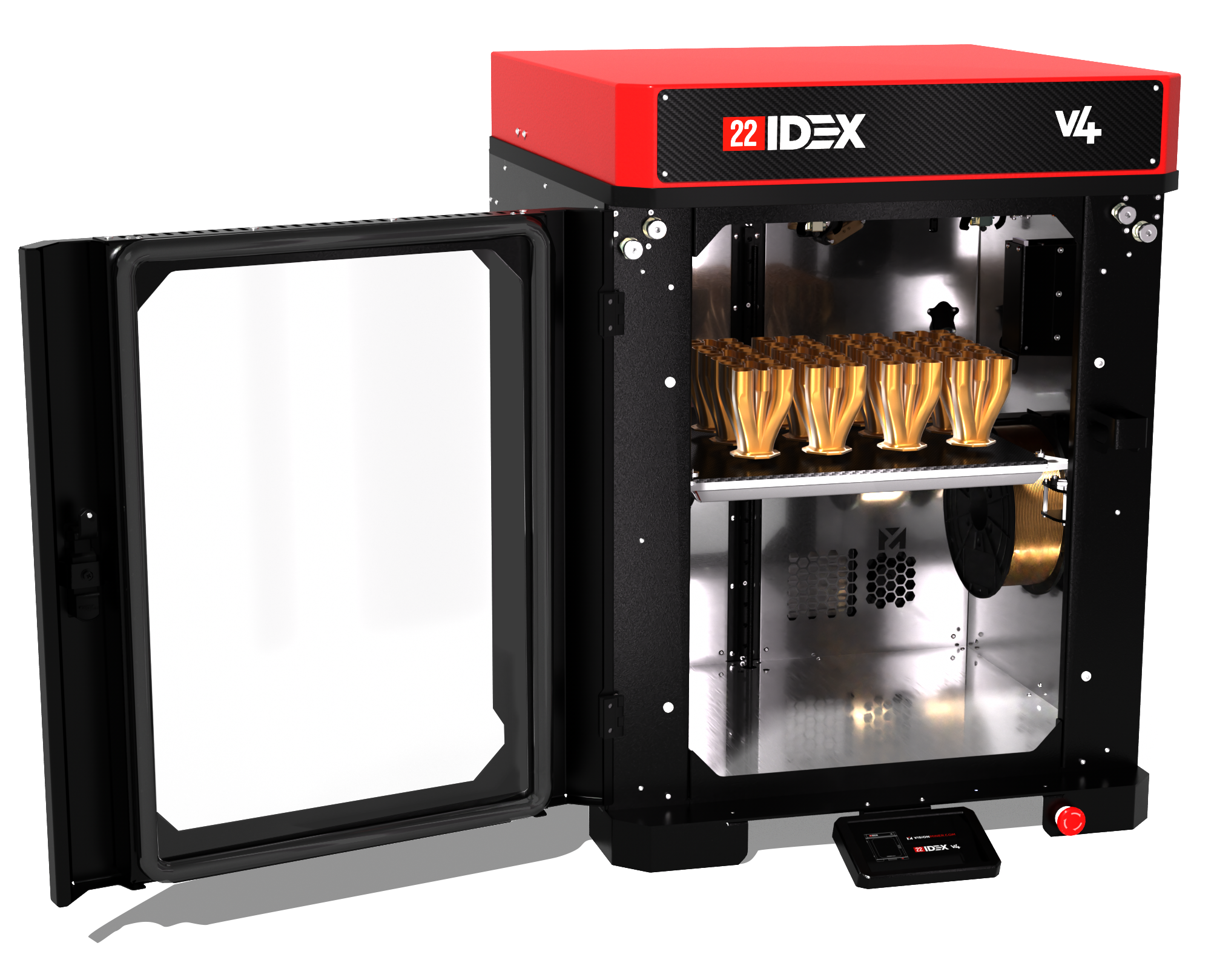
Our flagship printer wears the brand's red on its cap — a deliberate hardware-level identity cue. The same logic applies in print and screen: red owns the moment, the rest of the palette supports.
Two families do all the work in print, marketing, and video collateral. Gotham carries the running text and most UI. Bebas Neue Pro carries the display moments — section anchors, posters, banners, lower-thirds. Open Sans and Roboto handle the web. Print and web systems can be mixed where context warrants.
Our URL is the wordmark. It has a specific construction that must not be redrawn freehand — weights and colors are deliberate, and there's a reason for each choice.
Set in Gotham Black. Always black or white depending on the background. The heaviest weight in our type system — bold so it lands first and reads at any size.
Set in Gotham Medium. Always Vision Miner Red (#FF2800). Lighter than VISION on purpose — the weight contrast is what makes the wordmark feel like one mark instead of two stacked words.
As the logomark — headers, lockups, signage — no space between VISION and MINER.
In body copy, headlines, or running text, write it as two words: Vision Miner.
The .com signals we are a digital company, available globally, never limited by borders or brick-and-mortar. Wherever you see the mark, you know where to find us.
On apparel, branded merchandise, and trade show booths where the URL would feel redundant, the .com may be dropped. Keep the color split.
When the wordmark must reproduce in a single solid color — engraving, embossing, single-color print, signage — the color split is dropped. The weight contrast carries the mark.
Three lockups handle nearly every situation. The vertical M-over-wordmark is the default. The horizontal URL lockup is for headers, footers, and narrow-tall layouts. The square M-on-URL lockup is for tight crops, social avatars, and badges.
The horizontal URL lockup is the most-used variant on our channel. It anchors YouTube videos in the bottom-left corner, lives on the back wall of the studio set, runs as the header in every customer email, and goes on stickers we hand out at trade shows.
Top-left wordmark. Persistent on-screen attribution. URL lockup, full color, sits over the studio set wall.
Back wall. Large-format VISIONMINER.COM mounted prominently behind the presenter — anyone scrubbing or watching with sound off knows the brand instantly.
Bottom-left wordmark. Reinforced URL lockup at frame bottom. Survives most YouTube UI overlays.
Bottom-right · YouTube auto-subscribe. Not a Vision Miner element. YouTube adds it automatically. Don't treat it as part of the brand layout.
Customer-facing emails lead with the URL lockup. The dotcom is the call to action — the URL is the brand.
Laptop stickers, hard-hat stickers, booth banners, hand-outs. Wide format reads at distance.
Site navigation, blog bylines, partner-page mentions. Horizontal aspect ratio fits responsive nav bars without compromise.
Cover lockup on every downloadable document. Same placement, every time — the consistency is the point.
The logo system is deliberate. Treat it as fixed geometry — never modify, restyle, or improvise around it.
The M mark is bold enough to support imagery fills — Santa hats, flags, camo, seasonal patterns. Designers should feel free to get creative on these. Default marketing collateral never uses overlay variants.
Direct. Confident. Technically precise. We know the materials and the machines, and our customers reward expertise — not fluff.
The tone of every interaction. Our customers are technical; we meet them at that level.
We use what we sell. When a customer calls with a problem, we've already solved it.
Customer success is the only path to ours. The number-one priority of the company.
Every technical claim ties to a tangible customer outcome. If a spec matters, explain why — strength, temperature resistance, repeatability, time saved, cost saved. If the "so what?" isn't obvious, the claim doesn't belong in the copy.
"Our cutting-edge solutions revolutionize next-gen manufacturing."
"PEEK parts off the 22 IDEX hold their dimensions under heat and load — they replace machined metal in jigs, fixtures, and end-of-arm tooling."
"Industry-leading printer with unmatched performance."
"The 22 IDEX is built to run high-temperature polymers at production volumes — not as a once-a-month one-off."
"Empower your innovation journey with our solutions."
"Pick the right polymer the first time. Talk to an engineer before you spend on tooling — we pick up the phone."
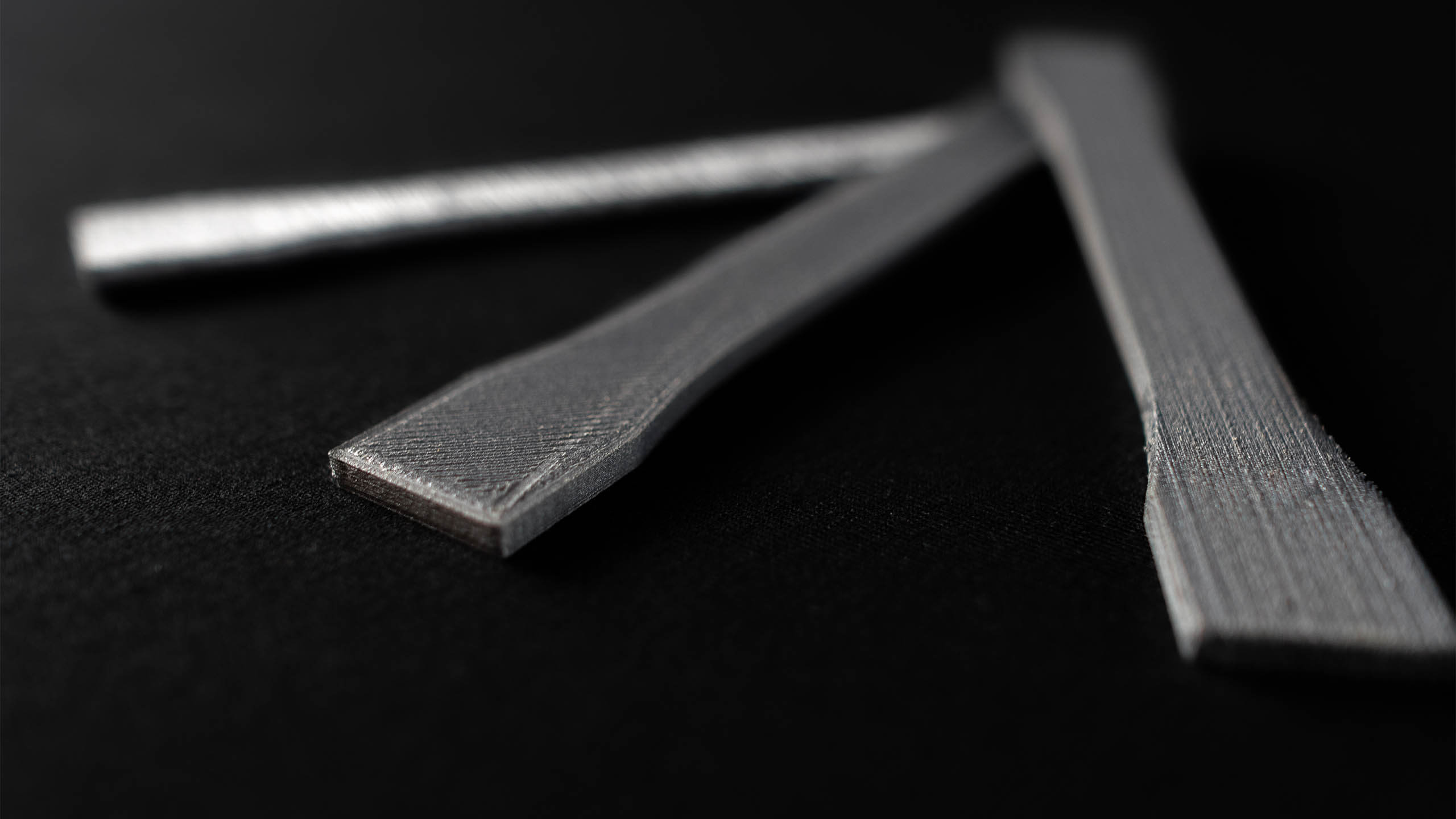
Photography is the brand's primary medium. Real parts, real machines, real customer applications. No generic 3D-printing stock, no fake studio polish. The work has to look like the work.
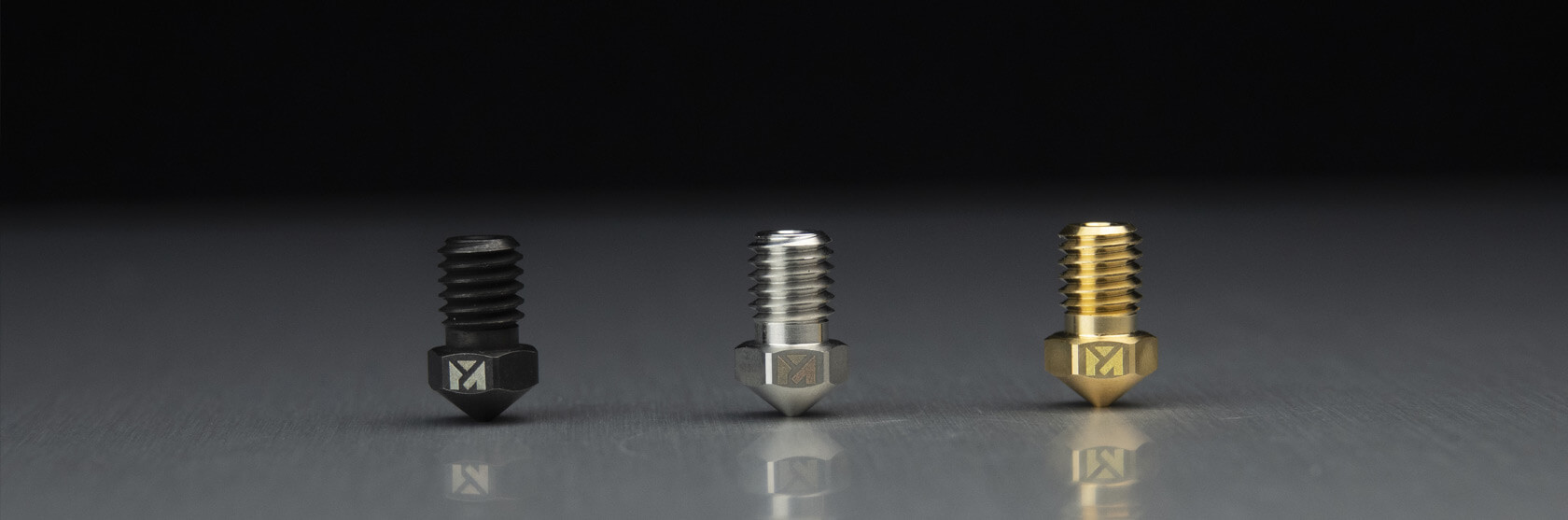
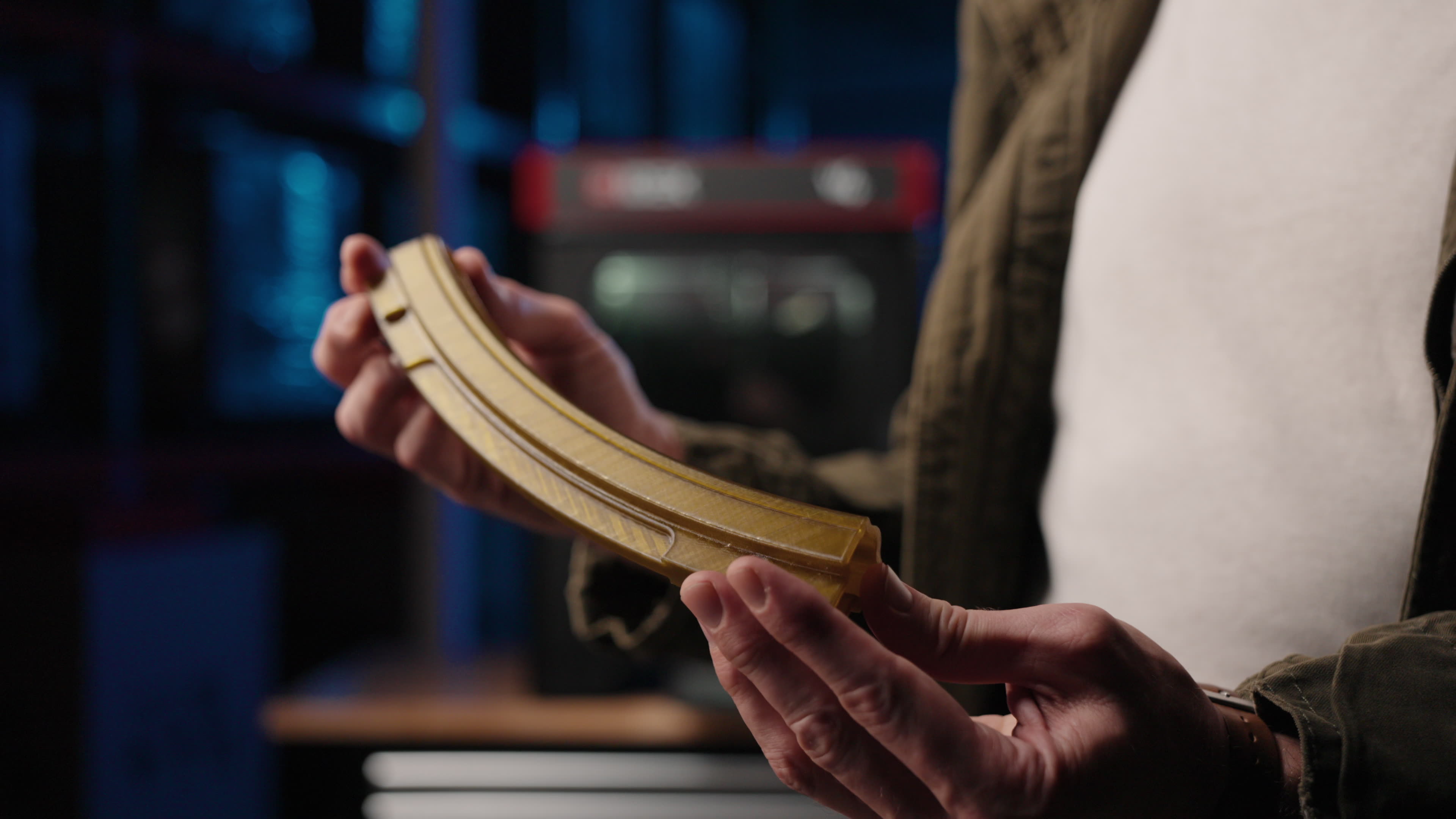
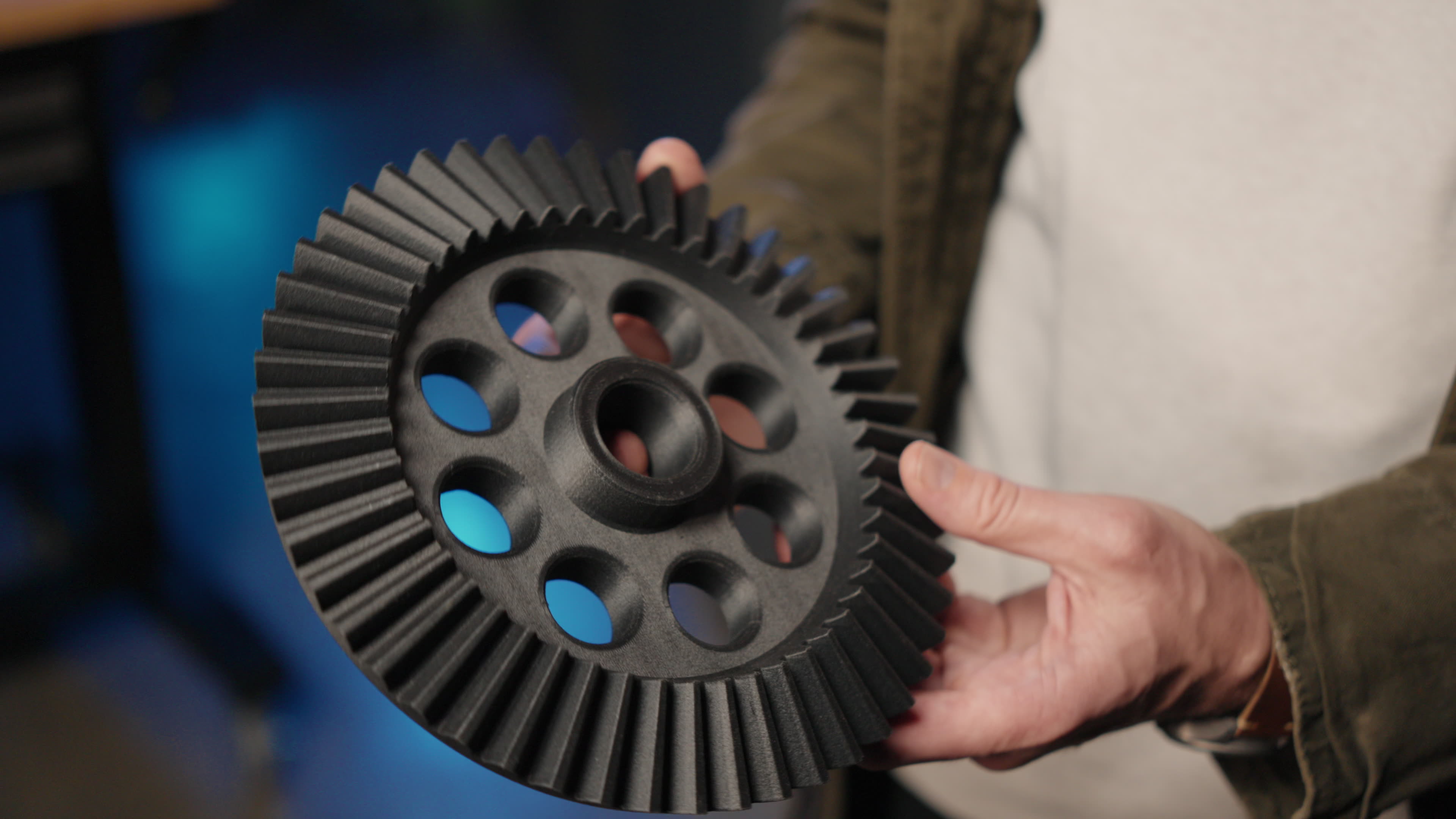
Two photography moves we lean on hard: macro for the small precision parts, and human hands for scale that grounds the digital brand in physical reality.
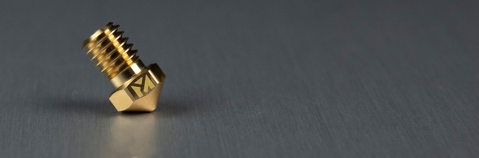
Tight macro on a single part — nozzle, hot end, heat break, gear. Logo or branded details where they appear naturally on the hardware.
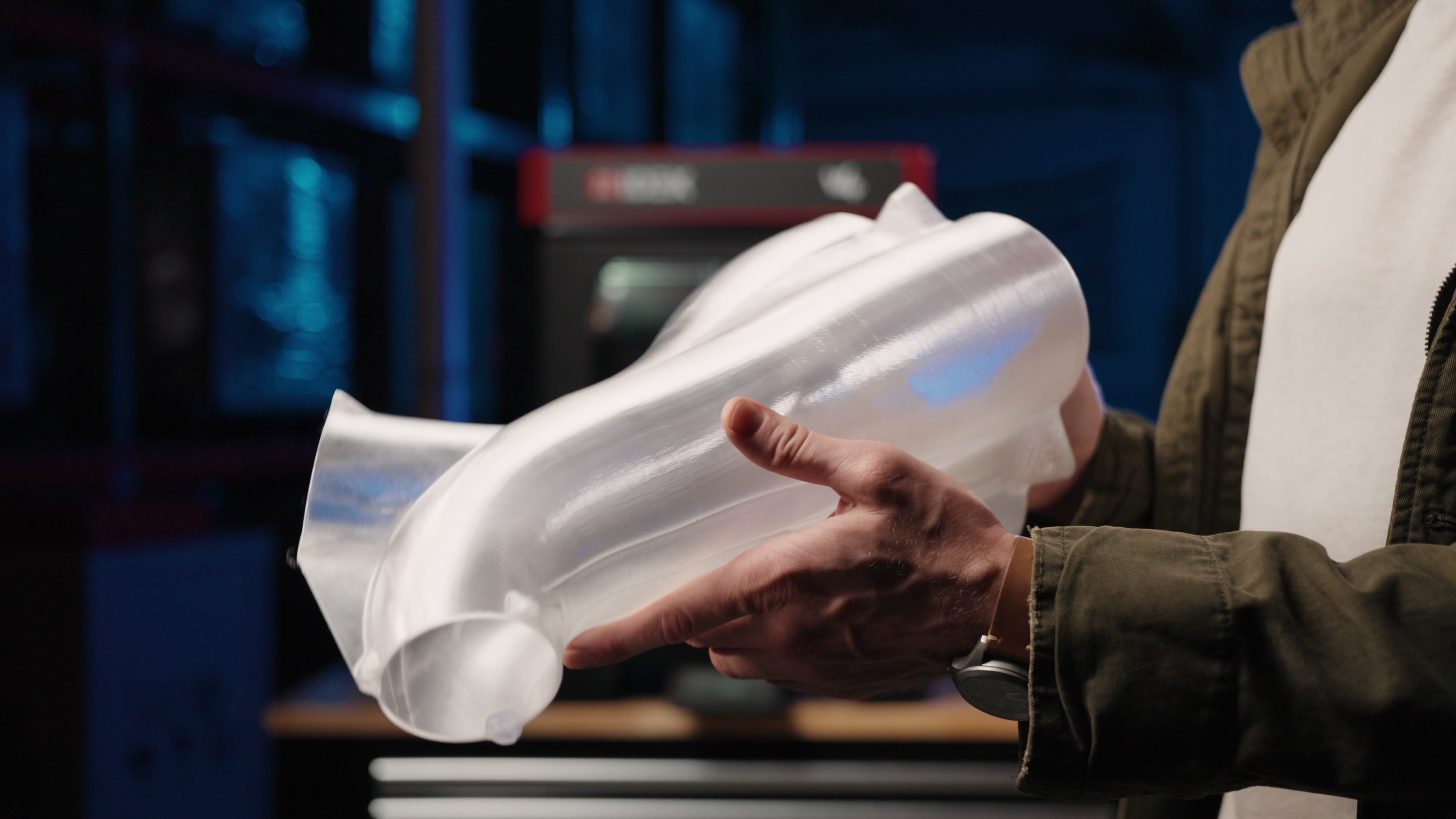
A hand in frame humanizes the digital. The viewer instantly knows the part's size, the user's relationship to the machine, and that real people work here.
Backgrounds are part of the brand voice. They set tone without competing for attention. We have a small, intentional library — turbines, low-poly, real carbon fiber, brushed aluminum, technical wireframes — and we use them deliberately.
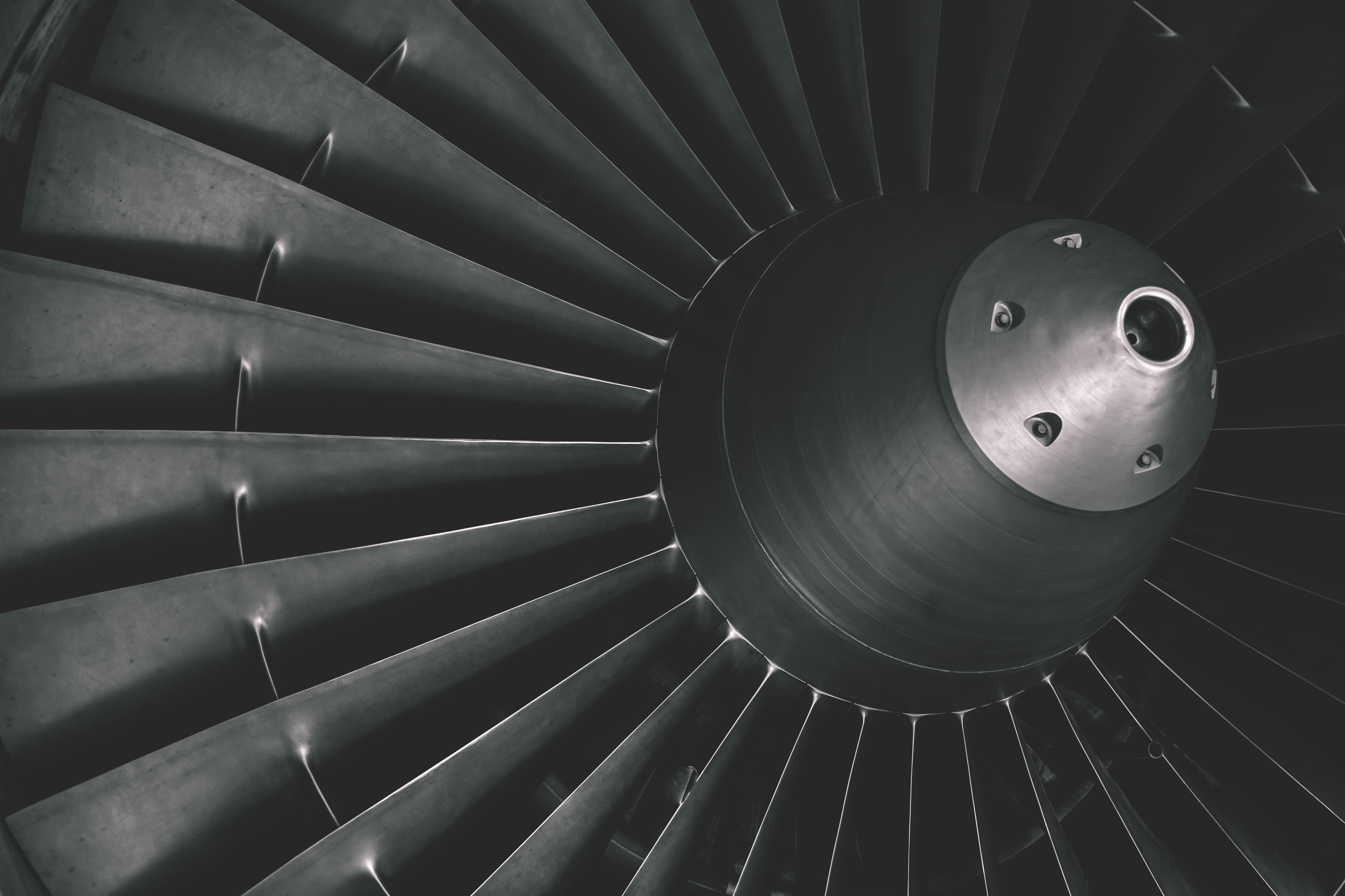
Sweeping turbine and engine imagery is the signature cover background. Carries weight and engineering authority.
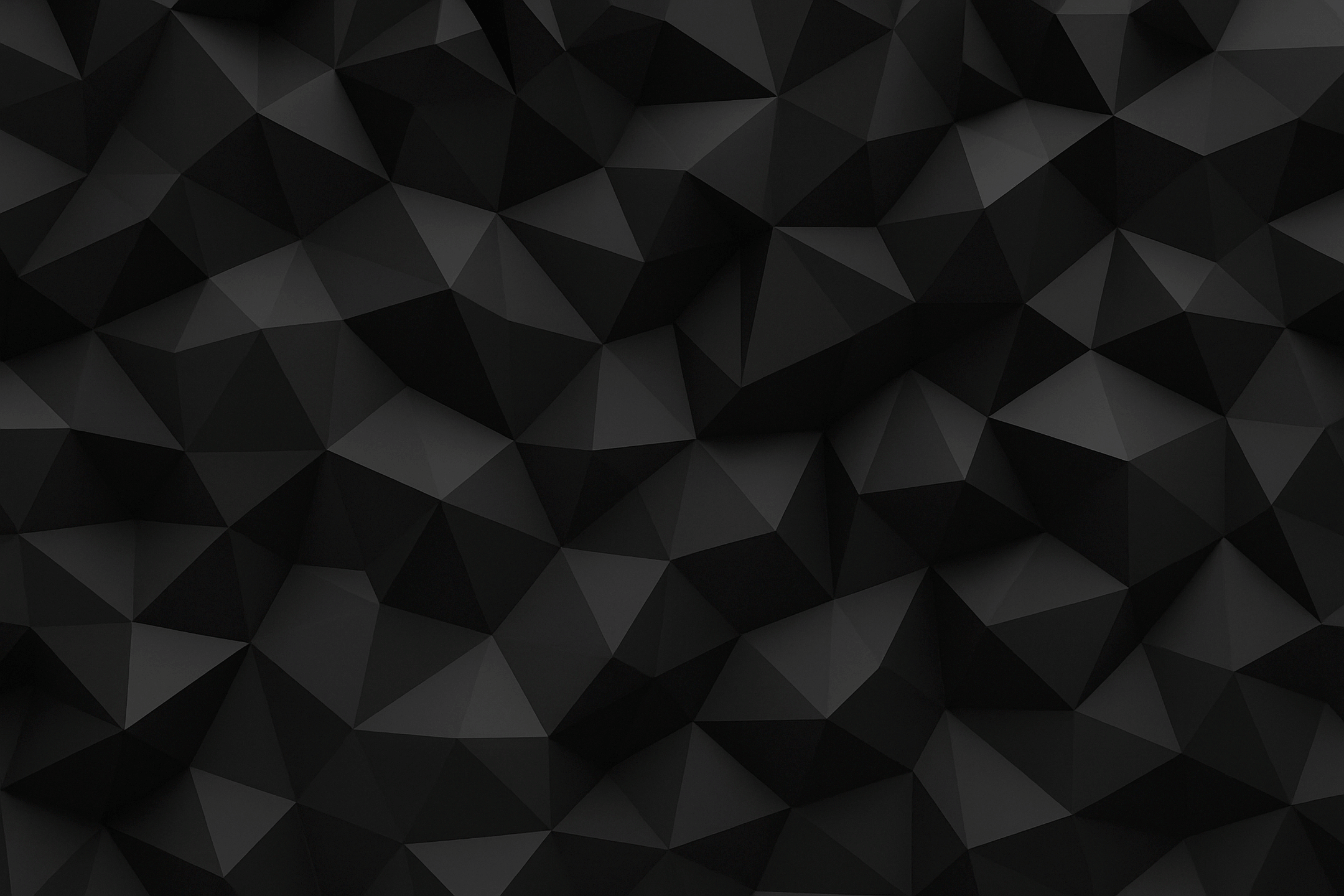
Geometric dark texture for sections where mood beats specificity. Always lightly overlaid.
Real engineering carbon fiber sends a clear message. Avoid fake-looking carbon fiber — viewers spot it instantly.
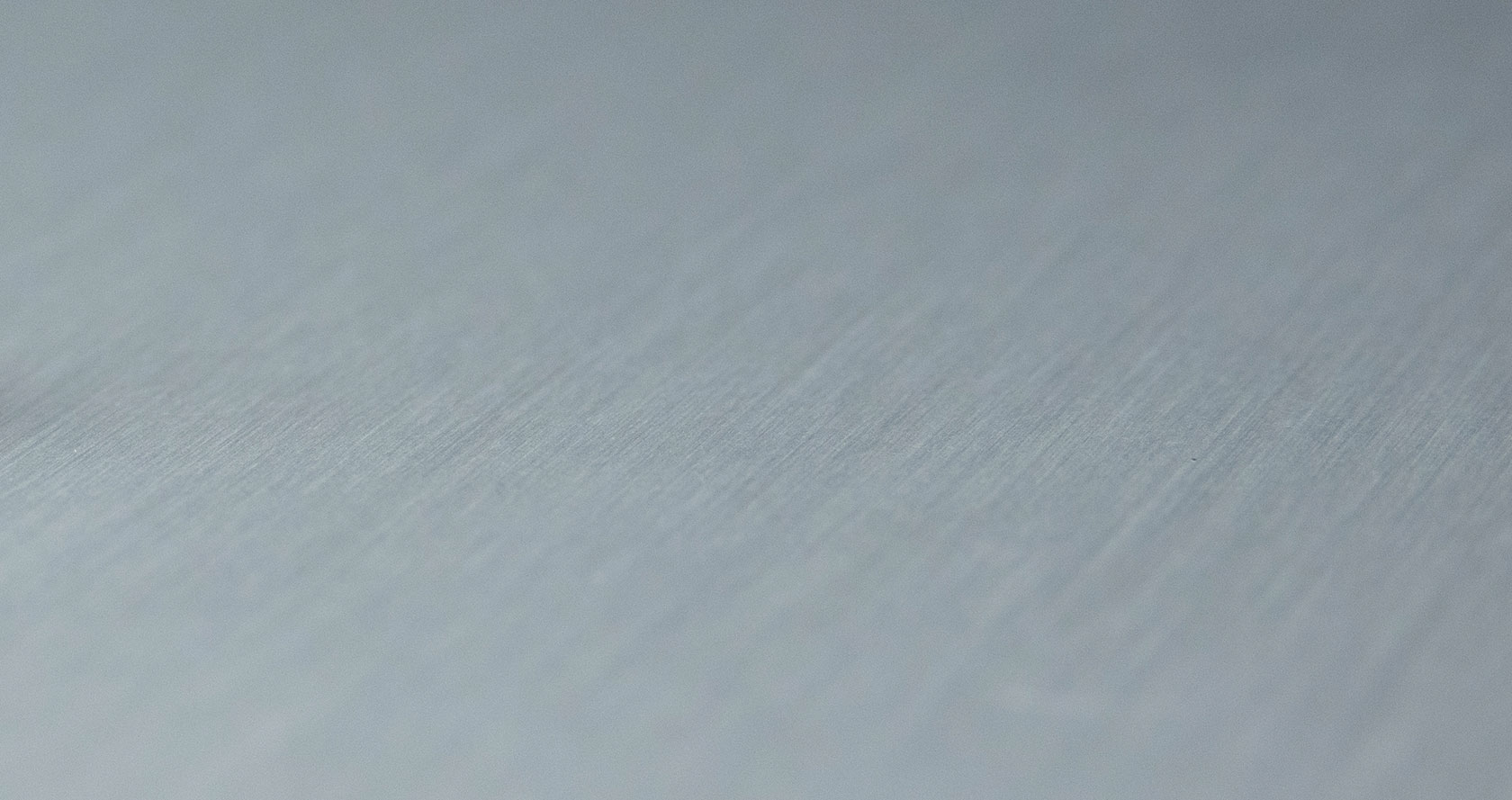
Light brushed aluminum reads as machine-shop surface. Pairs well with hardware-forward photography.
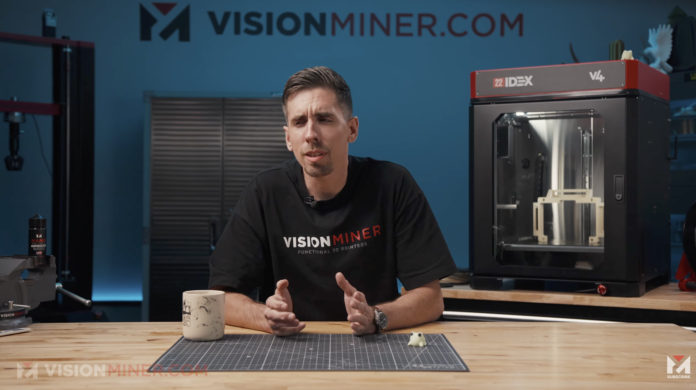
A deliberate counterweight to the high-tech digital nature of the business: natural light-wood surfaces. The video studio table, the trade show stand, hero photography ground planes — all live on light, natural-wood color. It grounds the brand in physical reality.
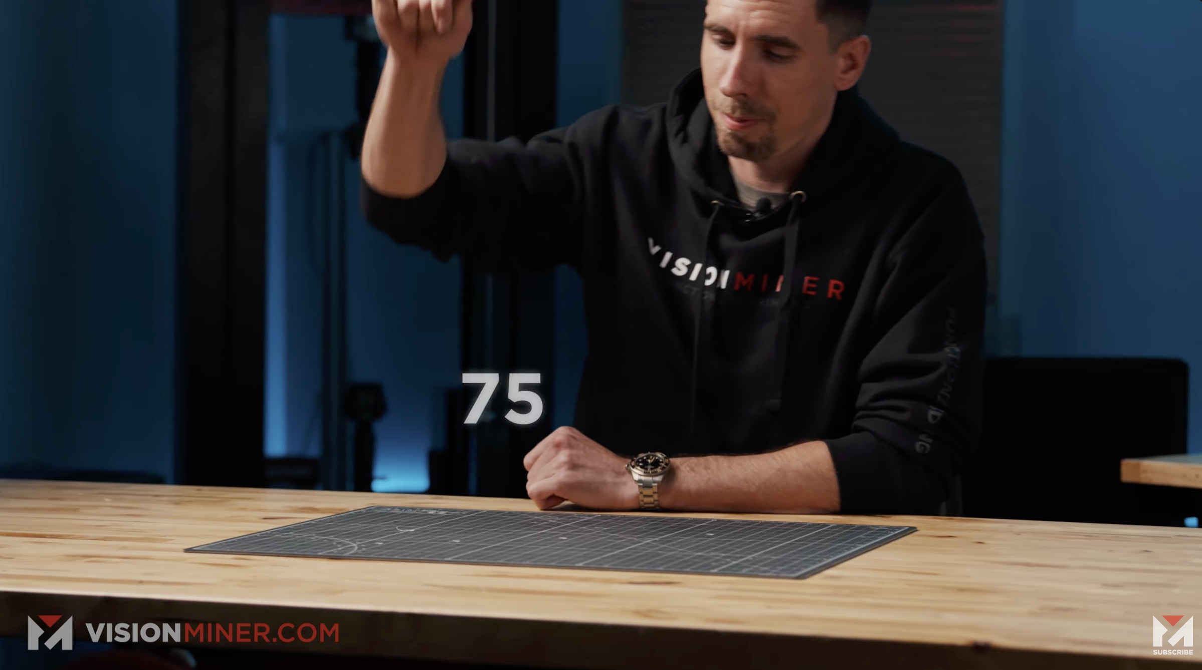
Surface: light natural wood — plywood, oak, maple, or birch tones. Never dark walnut, never lacquered or glossy. The grain should read.
Wardrobe: black Vision Miner branded shirts with khaki or tan pants. The contrast against the wood is part of the brand frame.
Backdrop: industrial — gray-blue painted walls, visible hardware, the 22 IDEX in the frame when possible. Never a green screen, never a studio sweep.
Logo placement: URL lockup top-left, reinforced bottom corners.
The 22 IDEX is our flagship production printer and the most-photographed object in the brand. The hardware identity — particularly the red cap — anchors the brand's product imagery.
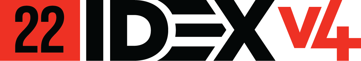
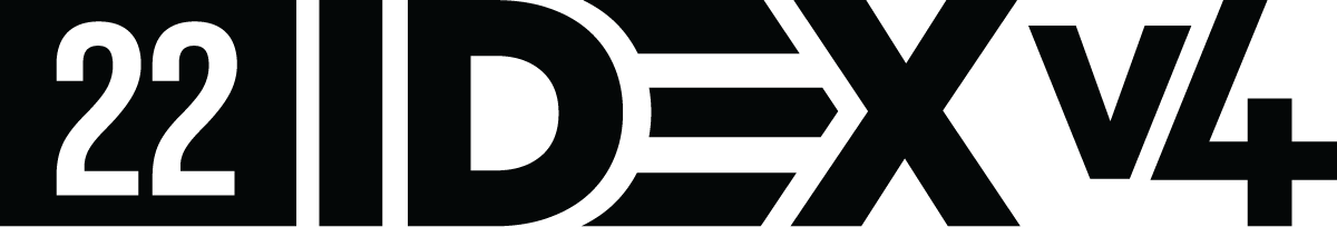
Six approved variants. Match the background contrast — full-color on light, full-color reversed on dark, monochrome for engraving, signage, or single-ink print. Never recolor or reweight.

A logo wall of the companies and institutions that have used Vision Miner machines or materials. We use this lineup to show prospective customers the company they'd be in. Always reproduce partner logos within each company's own brand guidelines — never recolor, distort, or compose on top of them.


Vision Miner is a multimillion-dollar business selling industrial-grade machines starting around $15k and polymers running $900+/kg. We're still a personal brand. Memes, jokes, and human moments are part of the voice — used deliberately, never as filler.
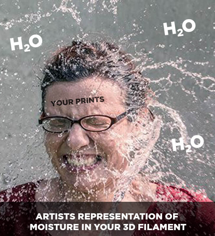
The meme talks about a real engineering problem — moisture absorption in PEEK and other hygroscopic polymers — in a way that lands with people who've lived through it. Engineers reward you for not pretending you're above the problem.
Social posts, video moments, internal team artifacts, occasional email touches. Not on the homepage. Not in proposals. Not on partner-facing decks. The personal brand earns its weight by appearing where it surprises.
Source files, asset requests, approvals on new overlays, and any deviations from the guidelines in this document go to a single inbox.
media@visionminer.com